

Dark patterns in UX design are tactical manipulations that incline towards perfection of actions, primarily beneficial to companies, often to the detriment of user experience.
Typical dark patterns include pressure on feelings, false urgency, enticement, collection of personal data, hard sell, slipping, masking advertising, intentional misrepresentation, Motel Roach pattern, pre-selecting unwanted options, adding unnecessary items to the cart, spamming emails. trust, minor extension of a paid subscription after its end and more.
Such schemes for constructing traps are used in light psychology for the purpose of profit, but at the same time there is the possibility of undermining the protection of users.
To avoid dark patterns, designers should emphasize transparency while ensuring safety controls as well as these practical developments. This approach contributes to a positive user experience and increased customer loyalty.
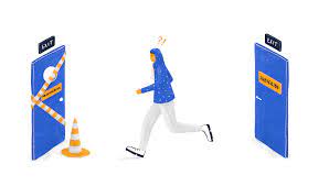
What are dark patterns?
The term “dark pattern” was coined by designer Harry Brignull. These patterns push or persuade the user to perform actions or accept conditions that they do not want. In this way, companies seek to make money by cunningly persuading users to perform certain actions.
For example, some of the patterns encourage or trick users into purchasing additional products, subscribing to news, or spending more time in the application. Designer Sally Wellner called them "scarily effective" in her TED talk. The way it is. These techniques focus on human psychology and marketing in an attempt to evoke primitive emotional and neurological responses.
Dark patterns rarely appear in the user experience by mistake. As a rule, they are carefully thought out so that they occur at the right moment of interaction with the interface. It happens that a design error made in the interface or implementation of the user action flow can contribute to the company’s earnings and mislead the client. But when a company deliberately makes design decisions like these that increase revenue by deceiving or inconveniencing users, they become dark patterns.
Why do people succumb to dark patterns?
Users are often drawn into dark patterns due to emotional or contextual triggers. For example:
Fear of missing out (your friend mentioned you in this post; urgently need to open the app to look).
Sunk cost error (needing to accept terms or sign up for newsletter to complete registration).
Frustration (refusal of hidden or overly complicated actions).
Confusion (ambiguous or implicit content or results of actions).
Guilt (“Are you sure you want to leave? Your friends will miss you!”).

If dark patterns are so bad, why do companies use them?
Here the question may justifiably arise: “Why do companies use such techniques at all?” And it will surprise no one that the answer to this question will be money.
Industries generate additional revenue by creating user experiences that entice customers to buy more, stay on the platform longer, or invite friends to join. This usually only works in the short term, often because it leads to unpleasant experiences that people remember more vividly than positive ones.
Common types of dark patterns
Let's look at some of the most common dark patterns in UX and their alternatives.
▍ Pressure on feelings
One of the most popular patterns. Pressure on feelings (guilt, pity) is used to convince a person to perform or not perform certain actions. There is nothing wrong with asking the user whether he is consciously performing an action and whether he really wants to complete it. However, the wording used can easily turn such a question into a dark pattern.
For example, Duolingo sends users an email with an image of a crying owl (their brand symbol) when they unsubscribe. This is one of the most universal and effective methods of influence: demonstrating sadness or vulnerability. We understand that in reality the owl will not be saddened by our departure from the service. Most importantly, we understand that this owl is not real at all. However, there is something that penetrates deeper than logic and directly influences our sensory nature.

▍ False urgency and fear of missing out
Creating a false sense of urgency is another very common technique.
Dark patterns focus exclusively on the interests of the company, neglecting the interests of the user. However, they use specific language and emotional manipulation to present the urgent notification as something valuable to the user. Most modern social networks focus on a person’s fear of missing out on something important. To do this, they simply hint to the user that something significant is happening in the application, without giving a specific explanation.
A good example is notifications like “Your friends miss you” or “You’ve been invited to an event,” which push us to find out what exactly they mean. When you click on such a notification, you find yourself in an application that can show you endless content, forcing you to stay in it for hours.
We all know and understand that companies are interested in customers spending as much time as possible in their applications. But this often goes beyond all adequate limits, and in reality such trends are deeply embedded in the lives of users without providing tangible value.

▍ Imposition
Imposition is, in other words, an unwillingness to accept “No” for an answer.
The most obvious example would be offering premium subscriptions or newsletters without the ability to permanently opt out. Replacing the “No” option with “Not now” or “Maybe later” deprives the user of a clear choice for the possible benefit of the company in the future. Ultimately, when the user gets bored, he may accept the proposed terms.

▍ Palming
“Slipping” involves inserting a secondary action into the middle or, more often, at the end of the main action. For example, the user wants to complete the current main action, but is not fully aware that there is another one in the process - a secondary one. It also happens that he is persuaded to take this action.
In the past, companies, mainly in the e-commerce sector, have already used this technique to include additional low-cost products (such as mugs) or hidden costs at the end of the action. And since the additional cost is very small, many users do not complain or ask for a refund.
Companies can and should suggest items that are potentially useful to the user, using either common sense or available data (for example, items that users frequently purchase together). But this approach becomes a dark pattern when a company purposefully includes products or services that the user is not interested in and that he would not otherwise even think about.

Advertising masking
Today, social networks are very clever at disguising advertising by presenting content in the form of cards, or “blocks,” with endless scrolling.
This allows them to insert promotional materials, presenting them as just another post. Social networks indicate the inclusion of advertising, but in a very secretive form so as not to attract attention to it. As a result, the user often confuses advertising with real content that interests him, often ending up on another site.
In other cases, a person simply views unnecessary information that is of no value to him.

Intentional misrepresentation
This pattern involves the use of visual or textual content to create an ambiguous, unclear, or worse, the opposite of the expected result.
Consider an example: a user wants to unsubscribe from a newsletter. When a question arises about confirming an action, the “Cancel” button can have two meanings: “confirm” the cancellation or “cancel” it. This is achieved through imprecise wording or the use of visual indicators (color, shape). Sometimes this can occur as a result of an unintentional error.

Roach Motel Pattern
The Roach Motel pattern is a case where the actions that benefit the company are intuitive, enticing, and even a little intrusive, while the actions that benefit the user are presented as complex, ambiguous, and tedious.
This pattern is often used to “push” the user into taking an action desired by the company through obfuscation or manipulation. This process seems extremely smooth and straightforward, but once completed it is very difficult to undo.
Most companies make it very easy to subscribe to a newsletter, and this opportunity is presented in the form of a large “CTA” (Call to Action) button. But unsubscribing occurs via email, and the user still needs to find the word “Unsubscribe”, written in small gray font that is easy to overlook. And even after a person has tried to unsubscribe, he may be repeatedly asked to confirm this action by filling out a questionnaire, which can discourage him from continuing this entire process. Sometimes you even need to call or come to the company office in person to unsubscribe.
Amazon users have had issues canceling their Amazon Prime subscription as well as deleting their accounts.
Ultimately, the company recently had to simplify the process for canceling this subscription in order to comply with EU regulations.

▍ Pre-select unwanted options
This dark pattern is often found together with the Roach Motel pattern. In the case of pre-selection, the user is not even persuaded to perform a certain action: the platform has already “pre-selected” this action for him. Again, this pattern concerns actions that are beneficial to the company, and which the user himself would probably not choose.
In such cases, a person may, for example, sign up for a newsletter or obtain premium travel insurance without noticing. When a company creates actions that are beneficial only for it, it must make sure that the person himself agrees to this action after the conditions are explained to him and the possible benefits are indicated.

Spam mailing to friends
In order to spam friends, companies persuade users to grant permissions and access to their contacts.
This action is often disguised as “Invite a friend” or similar language that seems to offer the user a positive outcome. In 2013, LinkedIn was sued for collecting contacts from its users. It got to the point where the platform sent emails to the user’s contact list on his behalf. And such letters could reach anyone, from a friend from student days to a boss at work.
Adding paid services or automatically renewing your subscription after it ends
Using this dark pattern, companies entice the user to provide payment banking data or information, sometimes even promising a free trial period or a discount in exchange for receiving a product or service.
After some time, the company begins to periodically charge funds for the subscription without the ability to cancel this option.
This is achieved through cunning formulations and manipulations, when a person is convinced that now he will not pay for anything. The fee begins to be charged after one or two months, when the user already forgets about the subscription.
In UX, it is important to provide the user with control and freedom in the actions performed on the platform, especially if there is a paid subscription among them.
This situation is easy to fix. To do this, it is enough to send a person an email in advance, 5 days before the end of the free period, informing them that they will soon begin to charge a fee from their card.
How to Avoid Dark Patterns in UX Design
If we want to avoid dark patterns and deceptive design, we need to have the right combination of research and common sense.
▍ Use of research data
Competitor Analysis: In case of research, it is important to collect information about competitors. What are some successful UX examples among similar platforms? Do their users complain about dark patterns? How do these platforms convince customers to sign up for newsletters or buy their products?
User testing is a great way to discover design flaws that can become dark patterns. It can also help you understand how users react to the language used, the interface, and the intended flow of action (for example, a premium subscription offer is too intrusive or the wording feels manipulative).
Here are some useful tips for avoiding dark patterns in UX:
Be transparent with users to earn their trust, and give them the freedom to act with sufficient knowledge.
Test and refine the product until a successful balance is achieved between the interests of the user and the company.
Follow best design principles and usability heuristics to maintain a focus on user experience and avoid common pitfalls.
Create patterns that benefit the user, even if it may harm the company. It is important for the user to feel valued and heard, and to realize that they control the platform, and not the other way around.
There are many ways to make the user feel valued and heard, even if it does not directly benefit the company.
YouTube has added two reminders: to take a break and close the application every X minutes, and also that it is not advisable to use the application at night, for example from 11:00 pm to 8:00 am.

The YouTube mobile app has a tool for adjusting how long you can use it. Although the platform itself encourages people to spend more time on it, these reminders help balance its use and avoid burnout.
The airline Ryanair also has a bright story with dark patterns. The company hid the “Don’t insure me” option inside a separate drop-down menu. This technique has been widely criticized in the past and is now illegal in the UK and EU. Since then, the company has made the interface much more user-friendly.
If you follow the strategies outlined, users of your app or platform will have a genuinely positive experience. This, in turn, will lead to satisfaction with the experience, positive reviews and provide benefits to the company in the long run. In addition, it also makes sites more environmentally friendly by reducing content, emails, newsletters, and unnecessary information in general.
Conclusion
We all understand that companies want to make money by offering products and services - there is nothing wrong with that.
But there is a difference between encouraging a user to interact with a platform in a comfortable way and inducing them to perform actions that do not benefit them, or punishing them for taking actions that do not benefit the company.
Companies have several reasons to avoid dark patterns. By following best design practices, they can project a favorable image, earn the trust of clients, and meet legal and ethical standards. In the long term, this increases transparency, prioritizes customer satisfaction and loyalty, which ultimately contributes to the growth and stability of the company itself.
As a UX designer, it's not easy to find a balance between the benefit of the company and a pleasant user experience. Sometimes we don't even notice how the designs we create cause dissatisfaction and even cause people to lose money. But taking a closer look at dark patterns allows us to better understand how to avoid them and improve the user experience. At the end of the day, we can always strive to be more transparent and ethical with our target audience and ourselves.
